Crafting a Unified
Publication Identity
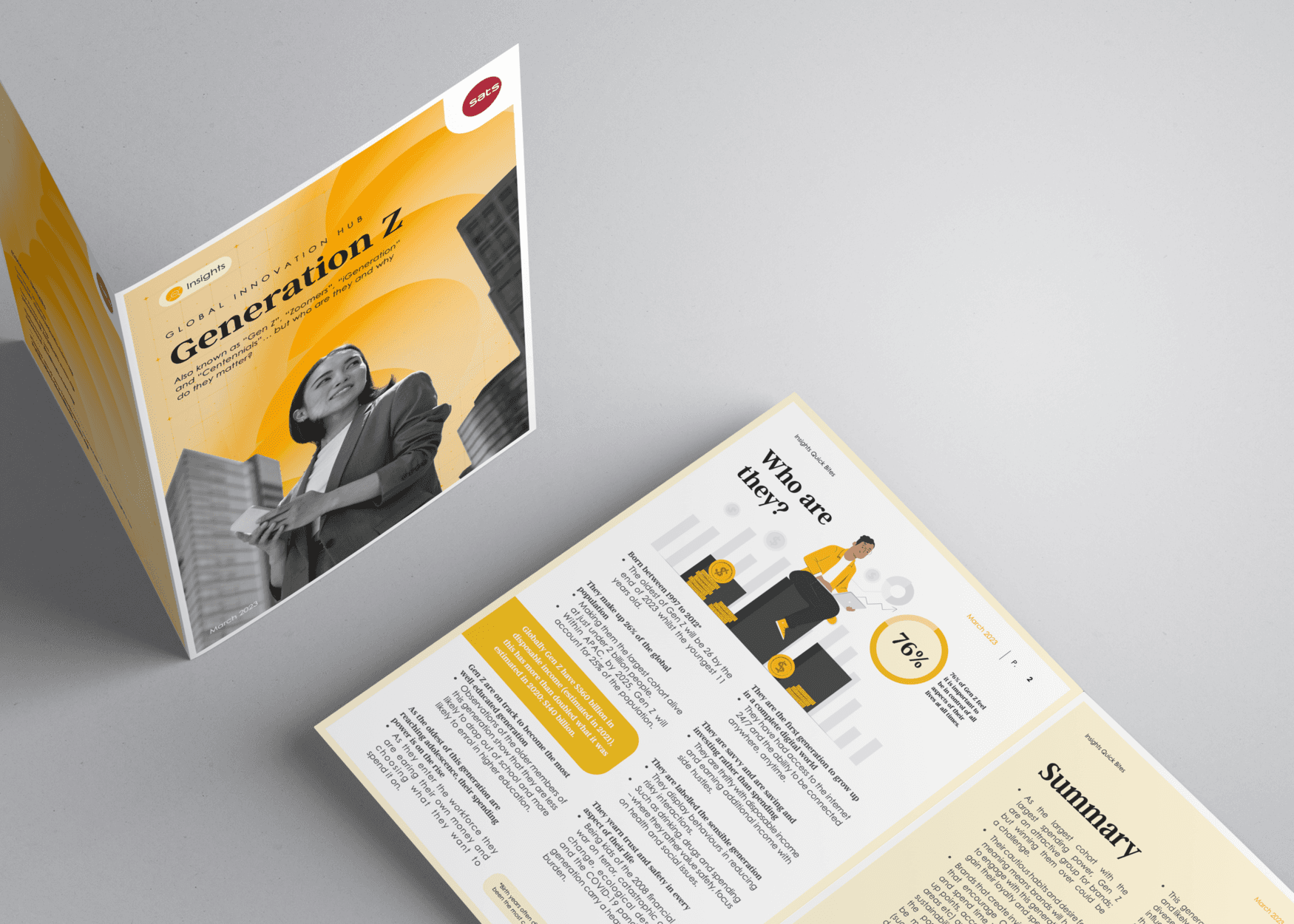
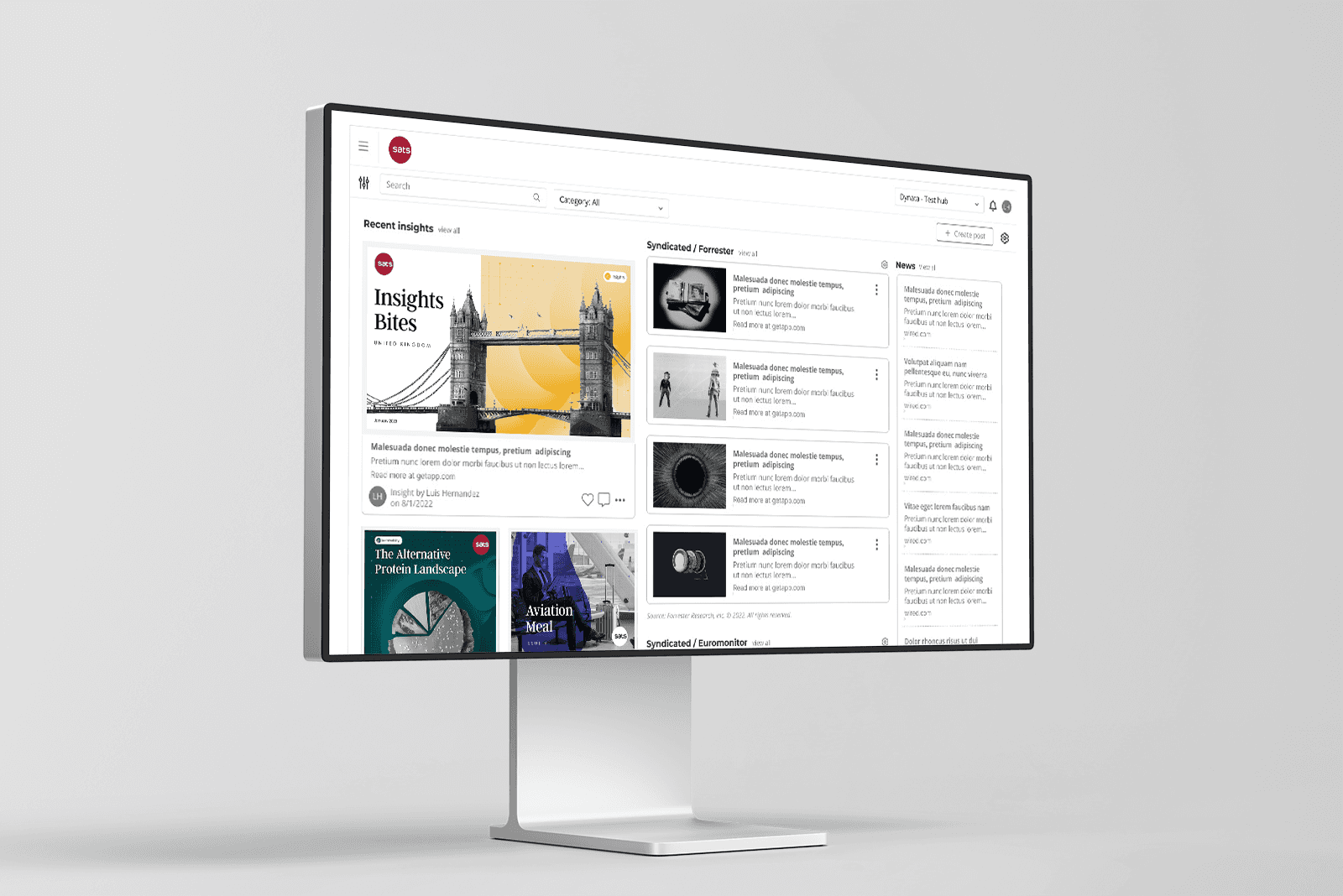
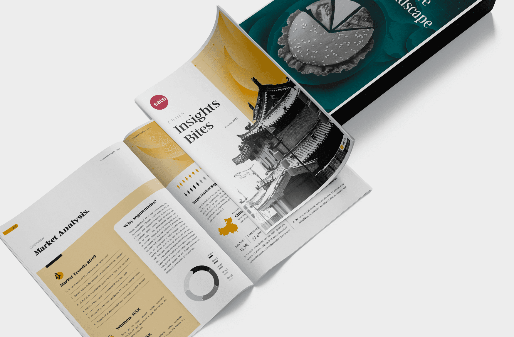
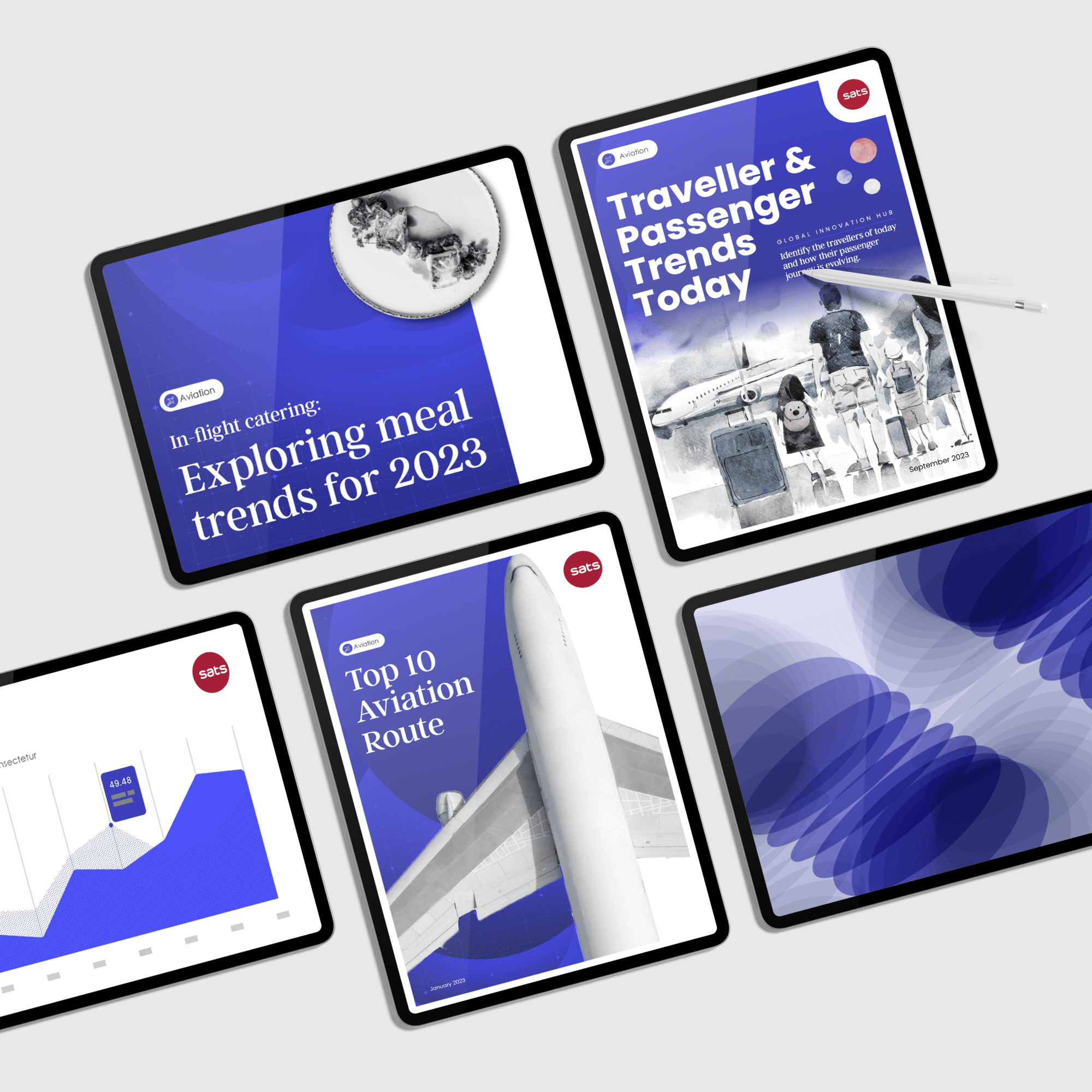
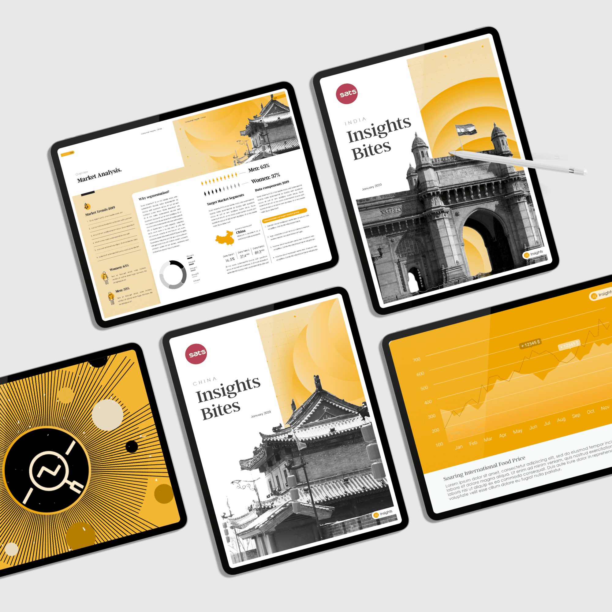
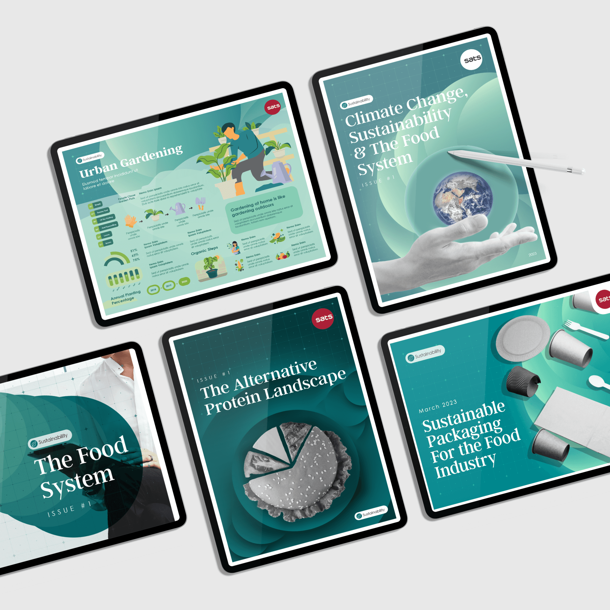
SATS, a leader in gateway services and food solutions, sought to redefine the visual identity of its internal publications. With materials spanning diverse topics like sustainability, alternative proteins, and aviation trends, the need for a cohesive design system became clear. The goal was to create a unified visual language that not only represented the SATS brand but also made each publication engaging, professional, and relevant to its internal audience.
Through thoughtful design and consistent branding, the project aimed to transform SATS publications into powerful tools that inspire and inform employees while reinforcing SATS’ commitment to excellence and innovation.
Company
Company
SATS
SATS
Industry
Industry
Innovation
Innovation
Deliverables
Deliverables
Visual Identity
Publication Design
Visual Identity
Publication Design
Challenge
Challenge
Challenge
The key challenge was harmonizing a diverse range of topics under a single cohesive visual identity. Each publication had its unique focus, requiring a design system flexible enough to adapt without losing the brand’s integrity.
Additionally, the new identity needed to resonate with a broad internal audience, ensuring that the materials were not only visually appealing but also easy to navigate and engaging. Balancing creativity with practicality was essential to create publications that both informed and inspired the SATS workforce.


